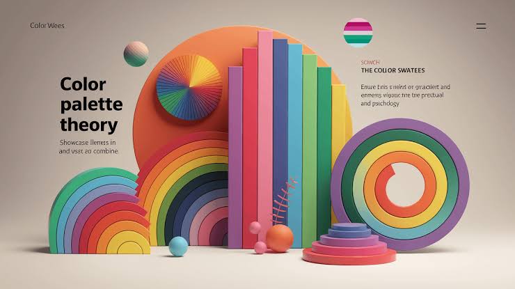
Color as an Environmental Signal
Color is one of the first elements people notice when opening a digital interface. Before reading a label or exploring a menu, viewers form an initial impression from the background, contrast, and relationship between different colors.
Digital casino interfaces provide a useful example of how palettes influence atmosphere. Dark backgrounds, bright highlights, metallic tones, and saturated accents can create very different visual identities. The same layout can feel calm, theatrical, playful, or technical simply by changing its color relationships.
Building a Consistent Visual Identity
A successful palette usually has a defined structure. A designer may choose one dominant background color, a smaller set of supporting colors, and a limited accent color for important interactive elements.
For instance, a dark navy background paired with muted blue-gray panels can create a restrained, modern appearance. Adding a small amount of warm gold may introduce contrast without overwhelming the layout.
A brighter palette might use coral, turquoise, and cream to create a more playful character. Neither approach is automatically better. The right combination depends on the intended visual identity, audience, and context.
Consistency is important because repeated colors help users recognize similar interface elements. If one shade consistently indicates selected tabs, changing it randomly across different screens can make navigation less intuitive.
Contrast and Readability Matter
Color choices must support more than atmosphere. Text, icons, and controls need sufficient contrast against their backgrounds, particularly when displayed on small screens or in bright surroundings.
Designers should avoid communicating important information through color alone. A warning, selected option, or status indicator can also use a label, icon, shape, or other visual cue. This helps people who have difficulty distinguishing certain colors.
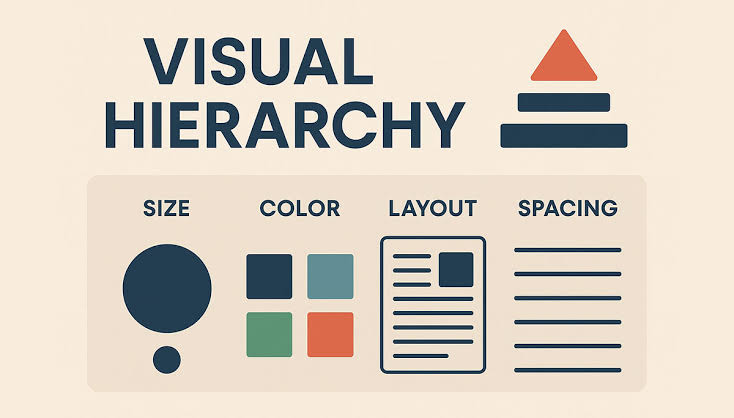
Bright accents should also be used selectively. When every button, heading, and decorative element uses an intense color, the interface loses a clear visual hierarchy. A limited accent palette makes meaningful elements easier to identify.
The Relationship Between Color and Emotion
Color associations can vary according to culture, personal experience, and context. Red may suggest urgency in one setting and celebration in another. Blue may appear calm or technical, depending on its saturation and surrounding colors.
Designers should therefore test their palettes rather than assume that every viewer will respond identically. Looking at a design across different devices and lighting conditions can reveal problems that are not obvious on a desktop monitor.
Atmosphere With Purpose
A well-planned color palette creates a recognizable atmosphere while supporting navigation and readability. In digital casino design, visual appeal is most effective when it works alongside clear information and accessible controls. Color can establish the mood, but the overall interface determines whether that mood remains comfortable and understandable.

One thought on “How Color Palettes Shape the Atmosphere of Digital Casino Interfaces”