
The Unexpected Appeal of Digital Imperfection
Digital interfaces are usually designed to appear stable, polished, and easy to understand. Buttons should respond correctly, images should load properly, and animations should behave as expected. Yet visual artists sometimes use the appearance of technical failure to create something expressive.
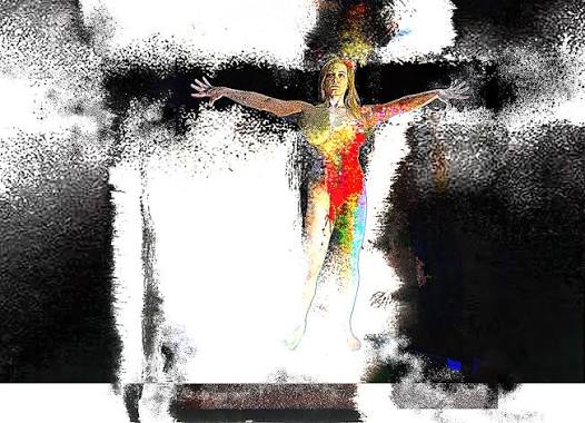
Glitch art is one example. It draws inspiration from distorted images, broken pixels, duplicated text, unusual color shifts, and interrupted digital signals. These effects can make an interface look unfamiliar, revealing details that conventional design often tries to hide.
Turning Errors Into Visual Elements
A distorted screen can suggest movement, instability, or a breakdown in communication. Horizontal lines may interrupt an image, colors may separate from their original positions, and interface elements may appear displaced.
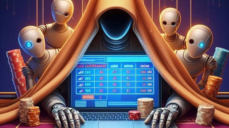
In experimental casino-inspired art, these effects can contrast with the clean grids and repeated symbols commonly found in digital gaming environments. A carefully placed distortion can interrupt an otherwise orderly composition and encourage viewers to look more closely.
For example, an artist might create a fictional game interface in which decorative symbols briefly fragment into colored blocks. The effect could communicate tension or uncertainty without changing the underlying artwork’s structure.
The important distinction is that the distortion is intentional. An actual technical error that prevents a person from completing a task is not automatically a successful design feature.
Balancing Expression With Usability
Glitch effects work best when their purpose is clear. In a digital artwork, a distorted label or fragmented image may create an interesting visual statement. In a payment form or account dashboard, the same treatment could make important information difficult to read.
Designers therefore need to consider context. Experimental visuals can be concentrated in backgrounds, transitions, promotional artwork, or optional animation. Essential controls and instructions should remain legible and predictable.
Motion also requires care. Rapid flickering, intense contrast changes, and repeated flashes can be uncomfortable for some viewers. Subtle displacement or occasional image fragmentation can communicate a similar idea without relying on extreme effects.
Imperfection as an Artistic Choice
Interface errors become visually interesting when they challenge expectations. They can reveal the artificial nature of digital images and create a contrast between orderly systems and unpredictable outcomes.
Rather than treating every distortion as a defect to be removed, artists can explore how digital imperfections influence interpretation. The result is not a less functional interface, but an artistic composition that uses the visual language of malfunction to question what polished digital design is supposed to look like.
One thought on “When Interface Errors Become Part of the Visual Experience”