At first glance, a busy screen can feel overwhelming. Colors compete for attention. Shapes move in different directions. Text appears scattered across the layout.
It can look like chaos.
But when you pause and observe more carefully, something subtle happens. Your eyes begin to follow a path. You start to understand what matters first, what comes next, and what can wait.
This is not accidental.
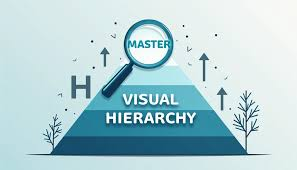
Designers use a powerful concept known as layered visual hierarchy, a principle deeply rooted in User Experience Design and Cognitive Psychology. It transforms complex, crowded interfaces into experiences that feel natural and easy to follow.
The result feels simple, even when it is carefully structured beneath the surface.
Why the Human Brain Needs Visual Order
Our brains are not designed to process everything equally at once. Instead, they prioritize.
Studies in visual cognition show that users form an impression of a screen in less than 50 milliseconds. That first glance determines where attention goes next.
When everything on a screen looks equally important, the brain struggles. This creates cognitive overload, making users feel confused or tired.
A well known principle from psychology, the Hick’s Law, explains this clearly. It states that the more choices people see, the longer it takes them to decide.
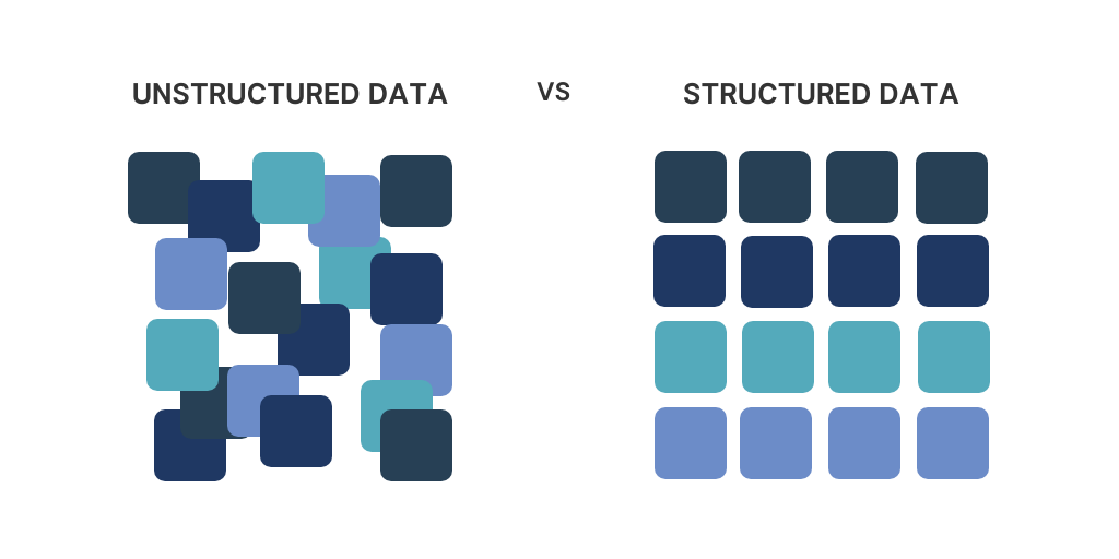
Another principle, Gestalt Principles, shows how humans naturally group and organize visual elements based on similarity, spacing, and contrast.
Real World Example
Think about opening a popular app like Instagram.
Even though the screen contains:
- images
- icons
- text
- buttons
You immediately know where to look.
Your eyes go:
- Profile or main content
- Interaction buttons
- Secondary details
That flow is created through layers, not randomness.
These examples show how designers use size, spacing, and contrast to guide attention naturally across a layout.
How Designers Build Layers (Without You Noticing)
Layered design works best when users do not consciously see it. They simply feel guided.
Here are the key tools designers use.
1. Size Creates Importance
Larger elements feel closer and more important.
Research in eye tracking shows that users spend over 70 percent of their viewing time on the most visually dominant elements of a page.
Example:
- Headlines are large
- Subtext is smaller
- Details are minimal
This creates a natural reading order.
2. Color Directs Attention
Bright or high contrast colors attract the eye first.
Soft or muted colors stay in the background.
Companies like Google and Apple use this carefully. Their interfaces often rely on neutral backgrounds with small bursts of color for key actions.
A study in interface design found that color contrast can improve task completion speed by up to 30 percent.
3. Spacing Creates Breathing Room
Spacing, often called “white space,” is not empty. It is a structural tool.
When elements have space around them:
- they feel more important
- they are easier to understand
- users make fewer mistakes
Design systems like Material Design emphasize spacing as a core principle.
4. Contrast Separates Layers
Contrast is one of the strongest ways to create hierarchy.
This can be:
- light vs dark
- bold vs thin
- large vs small
Contrast allows the brain to quickly group and separate information.
These visuals demonstrate how contrast creates clear levels of importance within the same space.
When “Chaos” Becomes Intentional Design
Not all interfaces aim for calm simplicity.
Gaming dashboards, financial apps, and live data platforms often appear busy on purpose.
For example, interfaces inspired by games like Fortnite or Call of Duty include:
- moving elements
- notifications
- layered menus
- real time updates
At first glance, this feels chaotic.
But underneath, there is strict organization.
Why It Works
Because designers control:
- which elements move
- which elements stay quiet
- where the eye should go first
A report in UX research shows that users can comfortably process complex screens if visual hierarchy is clear, even when there are dozens of elements present.
What Real Designers and Users Say
Professional designers often describe layering as invisible guidance.
A UX designer shared this insight in an online discussion:
“Good hierarchy means users never have to ask what to do next. The interface answers that for them.”
A user commenting on a redesign of a finance app wrote:
“The old version had the same information, but I felt lost. The new layout just makes sense without thinking.”
Jakob Nielsen, a pioneer in usability research, once said:
“Users spend most of their time on other websites. This means they prefer your site to work the same way as all the others.”
This reflects the importance of familiar visual structure and layering.
The Psychology Behind Why Layering Works
Layered design succeeds because it aligns with how humans naturally process information.
Key psychological factors include:
| Principle | Effect |
|---|---|
| Visual hierarchy | Guides attention step by step |
| Cognitive load reduction | Makes information easier to process |
| Pattern recognition | Helps users understand layouts quickly |
| Selective attention | Filters what matters most |
When these principles are combined, even complex layouts feel manageable.
This comparison shows how the same content can feel overwhelming or clear depending on how layers are applied.
The Quiet Goal of Great Design
The most effective designs do something remarkable.
They make complexity feel simple.
They turn crowded spaces into guided experiences.
They allow users to move naturally without confusion.
Layering does not remove chaos. It shapes it.
It organizes movement, directs attention, and builds clarity without forcing it.
That is why modern apps, websites, and digital products rely so heavily on layered visual systems.
Because when design works well, users do not notice the effort behind it.
They simply feel that everything is in the right place.


Leave a Reply